Sergio Davila — Visual Designer Portfolio ·

Clear,
considered
design.

Sergio Davila Web · Editorial · Motion
Approach

I design systems that make ideas clearer and products easier to trust. Every project starts with one question: what does the person on the other end of this screen actually need?

Disciplines 3

Web systems, editorial layout, and motion — connected by a bias toward structure, hierarchy, and things that work.

Standard

Polished. Consistent. Intentional. Good design is invisible when it works and unforgettable when it's right.

§ 01

Web

Conversion-led systems & product interfaces

Landing System

Strategy · UI · Components
LandingUXSystem

A conversion-led layout system designed from the ground up for clarity, speed, and reuse. Every section answers one question: does this make the next action obvious? The architecture is modular — swap content, keep the bones, ship faster.

Built to work equally well as a marketing page, a product landing, or a campaign surface. The grid is opinionated. The hierarchy is non-negotiable. The result is a site that loads fast, reads clearly, and converts without apology.

View project →
Landing page hero layout
Sections layout
Component details

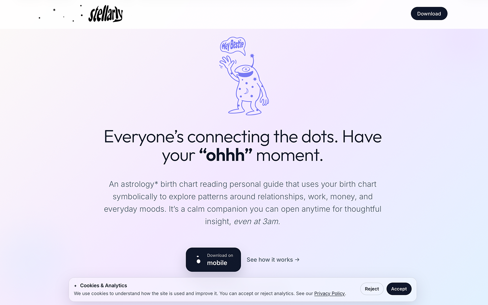
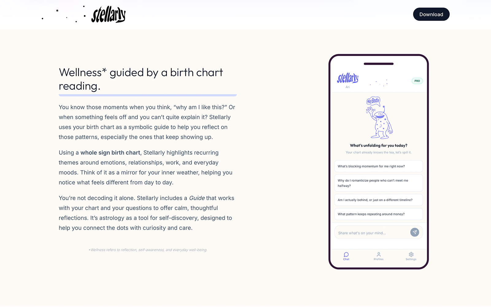
Homepage · Sections · Components

W — 02

Core Product Flows

Mobile UI · Structure · Clarity
UIFlowsMobile
Entry screen
Outcome screen

Entry · Completion

Product flows designed for calm clarity and decisive action — from the moment a user enters to the point they complete what they came to do. No dead ends. No decision fatigue.

Each screen was pressure-tested against one principle: does the person know exactly what to do next? If the answer was ever ambiguous, the design went back. What remained guides without pushing and informs without overwhelming.

View project →
W — 03

Lifecycle Creative System

Email · Paid · Iteration
EmailAdsPerformance

Performance creative built for speed, consistency, and relentless iteration. The system is modular by design — templates that flex without breaking, variants that ship without starting over.

Email modules, paid ad variants, and A/B test frames all live inside the same visual language. The result is a creative pipeline that can move as fast as the team testing it, without sacrificing the quality that makes the work worth clicking.

View project →
Email module
Paid ads
A/B frames

Email · Paid · A/B

W — 04

Design Components

UI Kit · Consistency · Scale
UISystemKit
Components board

Component system overview

A restrained component system built for one purpose: make consistency effortless. When every button, card, input, and state follows the same rules, designers stop making micro-decisions and start making meaningful ones.

Built to scale across surfaces — web, mobile, marketing — without fragmentation. The kit is the foundation; everything else is built on top of it.

View project →
§ 02

Editorial

Long-form layout, presentation frameworks & structured communication

E — 01

Long-Form Layout System

InDesign · Grid · Typography
EditorialGridHierarchy

Structured spreads built on modular grids and disciplined typographic hierarchy. This isn't decoration — it's architecture. Every margin, every column width, every type size earns its place by making the reader's job easier.

Designed for long reading: the kind of layout that pulls you through a piece without resistance, where the design disappears and only the content remains. Built in InDesign on a base grid that holds from cover to detail pages.

A great grid is invisible. You only notice it when it's gone.
View project →
Editorial cover
Editorial spread

Cover · Spread

E — 02

Presentation Framework

Narrative · Slides · Structure
DeckNarrativePersuasion
Presentation system
Presentation framework 2

Slide systems

Slide systems designed to carry an argument from first impression to closing conviction. The deck is not a document — it's a performance, and the design has to hold attention long enough for the idea to land.

Built around narrative flow first, visual treatment second. Every transition earns its place. Every data slide has a point of view. The framework scales to any content without losing the structural thread.

View project →
E — 03

Single-Page Communication

Collateral · Hierarchy · Clarity
LayoutClarity

Condensed layouts engineered for fast scanning and decisive understanding. The one-pager is one of the hardest design problems: everything that matters, nothing that doesn't, in a format someone might read for thirty seconds.

Getting it right means understanding what the reader needs to know, in what order, and how quickly they'll move through it. Hierarchy is the only tool. Used well, it's more than enough.

View project →
One-page layout

One-pager layout

E — 04

Editorial Composition

Print · Type Pairing · Photography
PrintTypePhotography
Editorial composition

Photography-led spread

Photography-led layouts with controlled negative space and typographic restraint. The image is the argument; the type supports it without competing.

Designed for print, where every choice is permanent. The type pairing was chosen for contrast — a serif that carries weight opposite a geometric that carries clarity. The result reads as editorial before it reads as designed.

View project →
§ 03

Motion

Motion & editing designed for comprehension & rhythm

M — 01

Educational Short

Premiere · After Effects · Full Production
ScriptingEditingMotion

Full production ownership from concept to final delivery. The brief was simple: make something complex feel approachable. The answer was pacing — information revealed at the rate an audience can absorb it, not the rate it can be said.

Scripted, shot, edited, and finished in-house. Motion graphics reinforce key points without decorating them. The final piece moves with intention from the first frame to the last.

Good editing is the art of knowing what to remove.
M — 02

Motion Graphics Study

Text · Transitions · Comprehension
MotionAfter Effects

Subtle motion built to support comprehension rather than compete with it. Every animation has a reason — a moment that needs emphasis, a transition that needs weight, a hierarchy that needs to be felt.

Motion that draws attention to itself has failed. The goal was motion you feel but don't consciously notice — the kind that makes the content clearer without making the craft visible.

M — 03

Video Editing

Pacing · Structure · Rhythm
PremierePacing

Pacing, rhythm, and structure — designed for understanding. The edit is where the piece lives or dies. It doesn't matter how good the footage is if the cut doesn't carry the audience through it.

This project explored the relationship between audio and visual rhythm: when do you cut on the beat and when do you cut against it? When does the edit serve the message and when does it get out of the way?

§ 04

About

I design across web, apps, and motion with a consistent bias toward clarity and structure. The work is only as good as the thinking behind it — and the thinking always starts with the person on the other end of the screen.

BA (Hons), Media & Communication — University of the Arts London. Self-taught in the spaces that matter: SwiftUI, motion, systems design, and the relentless iteration that separates good from finished.

I go by Sergio Davila creatively — born Jose Estello. I chose to carry the name my grandmother wanted for me. She's my biggest inspiration, and the reason I build things worth building.

  • Web systems & product interfaces
  • Conversion-led landing pages
  • Mobile UI & product flows
  • Editorial layout & print design
  • Presentation frameworks
  • Motion graphics & video editing
  • Brand identity & visual systems